Showing posts with label Documented Life Project. Show all posts

Wednesday, December 2, 2015

Art journal pages for DLP

 My intention to blog weekly went a little astray last week. Our main computer died suddenly even though it is a SSD drive that is supposed to be extremely reliable. The computer guy who built it said it was the first time he had seen a broken one in 20 years of working. We were just unlucky I guess. Fortunately I have the backup set up to run weekly so we only lost a few documents and none of our photos. It did take a long time to download all our programs again and set them up the way I like. If you haven't done a back up recently I urge you to do one soon.

 Now that I am back I will share some more journal pages. These are more of the Documented Life Project pages.


The challenge for this page was silhouettes and the prompt was "no shadow without the light". I used a credit card to scrape paint across the page for the background then used a stencil to do the flowers silhouette. I used a marker to fill in the lines of the stencil so it was a solid shape.


The art challenge here was to use deli paper. It is a very thin tissue paper with a waxy feel on one side. The waxy side is actually a thin coat of plastic. You can paint on either side but sometimes the paint comes off the waxy side. I used some monoprints I had done previously and just added the quote. It was a very quick page.


The challenge for this one was to use vellum and the prompt was "Sheer genius". I drew the big butterfly on vellum with a permanent marker then all the little ones too. I colored it in on the back using water-based markers so the colors are a little muted. I stitched the vellum butterfly onto white paper, I cut it out and glued it to the page. The page looked a little bare so I added the border as  finishing touch.

Sometimes I surprise myself with the ideas that pop into my head when I find a quote like this one. I would never have dreamed I could do this sort of page a few years ago.

I will probably share a some of the textiles I have been playing with next week so I hope to connect with you then. 

Monday, November 16, 2015

Catching up with DLP

 Today I am sharing a few more journal pages.


 The prompt for this page was about what advice would you give to your younger self. I tried to paint the whole page using only acrylics but in the end added some colored pencil for shadows. I was experimenting with some lettering too.


 I used acrylics and pencils for this page. I started with a photo of myself but it looked odd so I made the eyes bigger and lowered the shoulders. I have been doing too many whimsical faces and want to do more realistic portraits but it is going to take me a while to get used to the different proportions. That might be something I concentrate on next year.


 I did a whole page transfer of a wildflower photo I took. I used TAP (transfer artist paper) paper for the transfer and it only partly worked because of the texture of the paper in my journal. It was hard to see the flowers so I went over them with watercolor pencils but left the background mottled. I was happy with the way it turned out in the end. 


 This page started out as another transfer. I covered a picture with gel medium and left it to dry then turned it over and wet the paper on the back. I rubbed the paper off to leave an acrylic skin with the image stuck to it. I think I didn't allow the gel medium to dry for long enough before I removed the paper. When I glued it into my journal the colors all ran together and it was hard to make out the image. I decided to keep this as my background. I painted some sunflowers using transparent Golden acrylics (I read the labels to work out which ones were most see through) and pen. I dabbed on some glitter glue to the flower centers because the prompt was about all that glitters. Another journal page done.

It seems that most of my journal pages start out with one idea that often goes wrong so I just keep going until I get something I like. There are no mistakes in art and if you learn to not worry about it as you are going along you will have a lot of fun. Happy creating and I will catch up with you next week.

Tuesday, November 10, 2015

Art journal pages...watercolor and mixed media

 I am sharing some of the watercolours that I have done in my journal each month this year. I got the idea from Gina Rossi Armfield's No excuses art journaling book.


This was June. I used some of the suggestions from Gina's book to decide what to draw and added some seasonal images of my own.


July was a cold month here in Australia so I drew some of the flowers that were blooming then.


August was warmer than usual so we saw the arrival of lots of flowers. It was difficult to limit myself to only a few.


I had a little fun with the springtime animal sketching in September.


A DLP page with the prompt about seeing clearly. I used the quote "...one can only see clearly with the heart. Anything that is essential is invisible to the eyes" to inspire my page. I gessoed and used pan pastels for colour. I added detail with coloured pencils.


Another DLP page inspired by the prompt "If you are going to be weird be confident about it". I glued patterned tissue paper to the page and sprayed it with ink. The characters are painted with acrylics. It was a lot of fun to mess about with the girl and cat.

Tuesday, November 3, 2015

A new journal page.

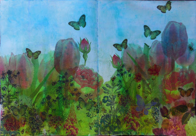
Today I am sharing a journal page I did for the Documented Life Project. The art challenge was to use tissue paper and the prompt was 'disappearing trick'.

I found a quote that I liked so that inspired me to do a flower garden. I searched through my stash of printed tissue paper but couldn't find any nice flowers that I wanted to use so I looked through my napkin collection (every art stash hoarding journaler has one, don't they?). I chose a few different napkins and tore the flowers out. I did trim around some of the flowers with scissors.

I first painted my page with white gesso then sprayed on colour with the dylusions spray. When it was all dry I arranged my flower cut outs to look like a garden bed.  I used matte medium to glue down the napkins and left it to dry.

 Uh oh. I knew that the napkins would become transparent when glued down but I didn't expect the dylusions spray that was mixed with the gesso to become bright green and change the flower colours. It was difficult to make out the flowers now so I decided to colour over everything with my prismacolor pencils. I was hoping the creamy wax pencils would cover up a lot of that green and also make the flowers more prominent. I also added some extra leaves in the blank areas and extended the flower stems so they reached the bottom of the page. It was a lot of fun to colour this way. Now I am happy that the page looks the way I imagined. 

 I will share some of my other pages and art I have been working on soon. I am planning to update my blog on Tuesdays from now on so that it forces me to be more regular about updating. I may even add extra posts in between but don't hold me to that.

Sunday, July 26, 2015

Documented Life Pages

 I have done a few more DLP pages in my art journal since my last post.


This one is sketched then painted with watercolor over gesso. I would prefer not to gesso the page when I use watercolor but the paper in the journal I am using draws the color right through to the other side so I have to use the gesso to stop it bleeding through all over the place. This is a simplified sketch of my front garden and home.


I used acrylics for this page. I stenciled the background then painted the woman. I used a magazine image to draw the woman and she doesn't look anything like the photo. Lucky for me it doesn't matter. The writing was initially green but it didn't stand out so now it is white. Never be afraid to change things in your art if they are not working.


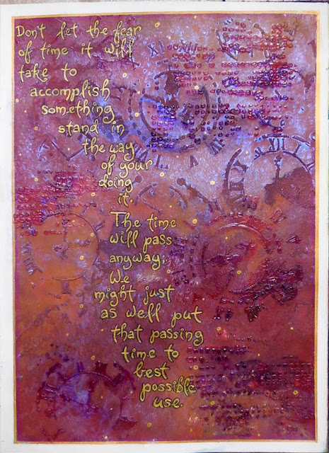
The prompt for this page was time. I wanted to use a clock stencil I have so I first used texture paste through the stencil. When that was dry I painted the page with red ochre and yellow ochre acrylics. I know that purple on top of yellow makes a rusty color so I sprayed on some dylusions purple and also some moonshadow spray in a purple color. When it dried I used clear gel medium through the stencil again and let it dry. The clear gel makes the colors underneath seem darker because they look the same as they do when they are wet. I had to find some flat areas to do the writing which was hard on this textured page. I used tracing paper first for the writing to make sure it would fit. Then I just wrote out the quote in gold and outlined it with black.

Next time I will share some of the index cards I have been doing and I have a couple of textile tutorials too that I have been saving. Thanks for reading.

Monday, June 22, 2015

Lots of creativity is happening...

I have been doing a lot of creative projects lately but I have not got around to sharing it with you lovely readers. Here are some recent works from the documented life project.


 The challenge for this page was to use stitching. I gessoed my page then sprayed on some color. I use acrylic paint with the stencil and then used the same paints and sprays to make a piece of muslin colored. When it was dry I used the sewing machine to sketch out some flowers. I cut them out and glued them to the page.


The challenge for this page was to use cheesecloth. I wanted to do a simple blob animal so I stuck the cheesecloth to my page in 2 blobs, one for the head and one for the body. I gessoed over the whole lot when the glue had dried. I used some runny watercolor paint to make blobs and blew it with a straw to get a rough shape of an animal. I used black pen to turn the blobs into a creature with a big smile. Very whimsical and crazy but it was great fun to do. 


The challenge here was to use texture paste. I really like the way this page turned out. I first painted the page blue and sketched out my drawing.


 I used a palette knife to spread the paste over the bottom of the page. I love to use Golden mediums because their pastes are extremely light and don't make journal pages heavy. I used crackle paste because that is what I had and I knew it wouldn't crackle on a journal page. It only crackles if it is on a tight or firm surface like canvas board.


Next I used that orange texture tool to make the clouds by running it through the paste while it is wet. I left it to dry overnight but it usually dries very quickly, sometimes in less than an hour. After that I used sprays and paint to finish the page and added a quote.


My watercolor page for April that I added into my journal. My main inspiration for this month was autumn and Easter.


The watercolor page for May was inspired by Mother's Day and also some flowers that were blooming in my garden.


The challenge for this page was travel journaling. I sketched some of the places I had been that week. I also added two textile pieces I worked on when I went to the monthly meetings of my textile groups. I used watercolors over gesso.

I have also been doing the ICAD challenge at the Daisy Yellow blog but will share those cards another day. I hope you get the chance to be creative this week.

Thursday, May 14, 2015

Using fabric in an art journal.

The challenge from DLP was to use fabric on a page. I learned this technique from Jane Davenport.

  •   I used clips to hold a teflon craft sheet to the pages underneath the one I was going to work on the protect them from the glue. This left the top page free. 
  • I laid my scrap of silk fabric over the page, adding extra pieces on the right to fill the page. 
  • I spread Liquitex Matte Medium on top of the fabric making sure it soaked through onto the paper so it would glue the fabric down. It is important to let it dry for several hours or overnight before drawing on it. 
  • When I came back I could see a couple of bubbles in the fabric where it hadn't stuck down so I applied more matte medium and let it dry again.
  • I trimmed the fabric back to the edge of the page.
  •  It is hard to erase on the fabric covered page so I laid tracing paper on top and sketched my design. This way I could see where to place the people on the fabric design.
  • I used white Saral paper (like carbon paper) to transfer the girls to the page. This was a dumb idea because it was a bit too waxy and showed up later when I was painting. I should have used graphite paper. I went over the traced image with a pencil so I could see it better.

  •  I used acrylic paints to color in the image, leaving the girls' dresses untouched. 
  • Initially I left a border around the page (you can see the outline in the sketched image above). When I painted the purple background color in I didn't like the colored border distracting from the girls' dresses so I painted over it with blue, letting the color blend with the still wet background. 
  • I started to add shading on the dresses with watery paint but it went through to the next page so I stopped and let the page dry.


  • I used colored pencils to do the shading and hair details. 
  • I glued some gold thread to page. It is Lurex and even though it gets squashed when I close the book it springs back when the page is viewed. I expect it will be squashed permanently one day.
The quote that inspired this page is:
Some people weave burlap into the fabric of our lives and some weave gold thread. Both contribute to make the whole picture beautiful and unique - Anon.

Wednesday, May 13, 2015

An abstract page

The word I used for my DLP page was ink. The prompt was 'before the ink dries' and I was going to try and do something with that but my ink was drying before I had time to do anything with it.


I coated my page with gesso first and let it dry. This journal I am using is like blotting paper and any wet media goes straight through to the next page if I don't gesso first. I took out 3 bottles of Dr PH Martins Bombay india ink to use (teal, brown and yellow). I used a paint brush to randomly apply some swishes of the yellow ink first. Uh oh...it was a lot brighter than I thought so I tried to use water to mute it but it was already dry and permanent. Next I put the teal right on top of the yellow and added a few brown swishes too. I sprayed water on top and tilted the page so everything would run together. While it was wet I flicked on a few brown dots too and then left it to dry. The next day I tried to find an image in the ink but all I could see was a few butterflies. I did them and then started outlining the painted shapes. After that I filled in some areas with doodles and added white pen doodles too. It is not my usual style but it was great fun to do.

Monday, April 20, 2015

Art journal pages

 The monthly theme for the Documented Life Project is color safari (exploring inks and paints).


 The DLP prompt for this week was water under the bridge and the challenge watercolor. Sometimes I have trouble with specific prompts so I am now just picking one word as my prompt. For this one it was bridge. I gessoed the page and when it was dry sketched the page then used watercolor to paint.  I used a bit of salt in the water and added extra sparkles with a white pen.


 The prompt I used was river and the challenge was acrylics. This is all acrylics and marker for the writing. I bought a really cheap set of acrylics (at Target) to try out and that is what I used here. They worked fine but are a little more transparent then artist grade paints. I think that will be good when I am journaling because the first layers will show through. They will be great to experiment with in my journals.


I didn't use a prompt this week because I wanted to do a tribute for Anzac Day. The challenge was to use a gelli plate so I did. I used printing inks because they don't dry as quickly as paint and it allows you more time to prepare your image before you print. I did the background first with some ink brayered onto the plate. When it was dry I used a paintbrush to put blobs of red ink on the plate for the flowers. I used two colors so some would appear darker. I did small flowers at the top, gradually getting bigger as I came down the page. It adds depth. I printed the flowers on another page then sprayed with water and did a second print on this page. I liked the soft look of the second print more so that is the one I decided to keep. I used colored pencils for the centers, stems and some shading to separate the flowers. I added the words and the page was done.

Thursday, April 2, 2015

Textured gesso and stamping.

The prompt for this week at DLP was to ride your own unique spirit so I chose spirit as my inspiration. The challenge was to make a custom element so I decided to do a textured background.


I started by laying a stencil over my page and scraping thick gesso over it. You could use texture paste if you wanted to.


After I removed the stencil I used the palette knife to apply more gesso across the bottom and pressed the stencil into it so I would get a slightly different look.


 I used a heat gun while the gesso was wet to make bubbles. Where the gesso is thin you will get smaller bubbles. Here you can see the large bubbles in the thicker areas of gesso. Make sure you do this in a well ventilated area. You do not want to inhale the fumes from the heated gesso. I usually do it near an open window or outside.


At this stage only the top layer of gesso has dried so when you let it cool and then press the bubbles down you get a more textured effect. I then usually let the gesso dry for 10 minutes before continuing. 


Next I used acrylic paint to color the page. I used aqua and white for the top and blended that into a bronze metallic paint at the bottom.


The metallic paint wasn't very shiny so I added some copper colored Viva Inka-gold over the textured area. It doesn't show up in the photo well but it makes the texture stand out more. 


I used bubble wrap to apply green paint to the background for visual interest. I stamped dandelions using stazon ink.


The stamped flower stems were too small so I used a brown sharpie to make them longer. Notice how I didn't make all  the stems reach the bottom of the page. I also wanted the flower centers to be darker so I used the marker for that too. If your stamping doesn't come out dark enough it is ok to go over it with markers. You are in control of your journal. 

I wrote the quote on tracing paper first to make sure it would fit into the space I wanted then used a copper pen to add it to my page. This whole page only took me just over 1 hour to do. It is very typical of my style of clean backgrounds and colors I love.

Wednesday, April 1, 2015

Pastel workshop day 2

 The second pastel painting I did during my 2 day workshop was another picture with the eyes closed. The workshop tutor gave us eyes closed photos to use to make it easier for beginners to draw. It did work because everybody had a pretty good picture at the end of the day, even the beginners.


I tried to go with a darker tone this time but I still ended up with my usual style of soft coloring and blending for faces. I am happy to recognize that and accept I my own artistic temperament. This picture is pretty close to the photo we were given.


After looking at the finished picture for a while I decided I didn't like the hair across her forehead. It is realistic because it is the way it was in the photo (and how we were taught to do) but I decided to tidy up her hair for her. I liked it much better now and it seems to make more sense to me without the forehead hair. I forgot to take a photo before I framed it so it is a little duller behind the glass. I want to try another portrait like these but with eyes open this time. I just have to find a model to get a photograph of.  
 My DLP page for week 11 was about borders. I was initially going to use only four colors but somehow those extra colors made their way onto my page. Is it weird that I like to do softly colored portraits but my journal pages have a lot of bright color? My writing exercise this week was the color the negative space around the lettering.

 This DLP page is about Focus. I found a quote I liked and decided to do my first face in this journal. I was going to only use acrylics but at the end I added a little pencil to define the details, especially the eyes and hair. I did manage to go darker with my shading for this portrait and resisted the urge to smooth out the shading. I can go messier if I want, lol. I chose a wonky style of writing for my quote and highlighted a few letters here and there.

Next post I will share the technique I used for my current DLP page. 

Monday, March 23, 2015

Lots of exciting new things...

I have been very busy lately trying new art techniques. I love to keep learning new things and experimenting whenever I can.

First I will share the little demo piece I made for my technique book using the rusty materials that I made with the textile group. I tried to use some of each fabric that I had colored with rust and dye. I added some hand stitching with the rusted threads I made (I had saved the cotton string that I wrapped the rusting objects with) and a little bit of green thread.


 Next I am sharing my week 9 DLP pages. The left is my writing exercise for this week, using journaling boxes and filling them with words. I like the way this looks and will use it in the future. The page on the right is a technique I learned from 21 secrets a couple of years ago and fun to do. It is a bit of doodling but not excessive so I didn't get bored with it. A few people mentioned this would make a great quilt and I can see it as a fabric wall hanging or something. I may use a version of it soon.


 This page is my watercolors for March which is summer time here. Simple sketches and watercolors.

After this I spent a lot of time experimenting with a new textile technique I learned with my group. It is sun painting and was a lot of fun. I will share the details and examples next time I blog.


The final piece I am sharing is from an art workshop I did over the weekend. It was with David Wells who is a master pastel artist. His portraits are incredibly realistic but very captivating too. I have not properly used pastels before (only played with pan pastels a bit) so it was new for me. It was also my first realistic portrait. I am pleased with the way it came out and although I can see where I need to improve I had a really fun time. David was very sharing with his knowledge and encouraging to all.


 Best of all I really liked using the pastels. In the past when I have tried them I didn't see the possibilities of this medium but now my eyes have been opened. I may even like them more than painting because I love not having to clean up paint and paint brushes. When I finished for the day I just put the pastel down and walked out of the studio. I have broken my self imposed embargo on buying new art supplies and ordered a whole bunch of new products to continue with the pastels. My heart is fickle when it comes to any form of art....I love them all.