Showing posts with label nature. Show all posts

Wednesday, August 19, 2020

Keeping busy last year.

 It has been a lot longer since I last blogged than I thought it would be. I enjoyed my trip to the UK and saw a lot of art while in London. Sadly I think it will be a long time before I get to travel overseas again. I also did two other trips with my husband within Australia and a lot of textile workshops with international artists. 

 I made these two 15 x 15cm pieces for a fundraising auction at Fibres West. One was an experiment of painting on metal mesh and the other was a doodle design with transferred photos of leaves.


I painted watercolour ground on the metal then used watercolour paints for the flower and leaves. I machine stitched on the metal shim border and added a hanging chain.


First was a residential week long textile art course with Alysn Midgelow-Marsden at Fibres West where we experimented with metal fabric.This was an exercise we did.

I have since used the samples we created, as well as some extra experiments I did when I got home, to make these book covers. 


The local embroiderers guild had a conference to celebrate their 75th birthday and I did 2 workshops with Kathryn Harmer Fox 


Our textile group organised another weekend workshop with Alison Holt. My piece was very small but I intend to do some bigger ones now that I understand the techniques.

 My textile group did a challenge for our display at the craft fair where the theme was "Words". This could be interpreted in many ways. Here are my three pieces. 

 It was a busy year. I will share more in my next post which will be shortly.

Saturday, January 19, 2019

A few thoughts on design

I don't believe in following rules when I make art but there are a few design techniques that I do use so I thought I would share with you a textile art piece I made and how I did the design of it. I also do the same thing when I art journal or paint.

I usually begin with an idea or challenge suggestion to start my piece. Sometimes I will do a quick sketch if I need to work out how to do it but most times I do not. For this piece I went through my stash looking for something to use for a textile art piece.

I found the photo transfer leaves that were left over from another project and the coloured metal pieces, painted with alcohol inks, that were also left from the same project. I decided to use them so that was the beginning of my colour choices. The leaves and metal were rusty red, orange and yellow so I looked for a suitable background.


 I found this blue background that I thought looked good with the oranges and reds. It is a paper towel that was placed under fabric I was dying. It had been dyed and also has splashes of paint here and there. I also found some scraps of green fabric that were also leftovers. I wasn't sure if I would use all of these things but they were my starting point.


I laid the metal pieces in wavy rows and stitched them down using a variegated thread on my machine. I made sure to stitch along the edges and over all the points of the metal so they wouldn't scratch my hands later on. I have done similar designs on paper so wanted to try this with stitching.


 Next I decided to add more stitching lines in a brown to compliment the metal strips. I then felt I needed to add some light tones because the whole thing was a medium tone, so I did the white stitching and couched white cord to the piece. I used the machine to stitch some grids over areas of the background that I didn't want to save. The grids also help to lighten the piece.


I laid the leaves I was going to use on the background so I could see how it looked before stitching them on. I put them off center as I don't usually like to place the focal point right in the middle of my work.  I decided that they were blending into the metal strips too much. I placed a darker leaf on the piece and thought it looked better than the light ones. I usually try to use light, medium and dark tones in my work. It makes a nice contrast and dynamic picture.  I chose the leaf shapes I wanted and then coloured them with alcohol inks to make them dark.


The reason I chose these leaf shapes was because I liked the way the stems looked. The taller middle leaf is fairly straight and the two leaves on either side have stems slightly tilted towards the center leaf. It looks more interesting to me than the three straight leaves in the picture above.  I did not attach the leaves yet because that will be one of the last things I do.


 I used the scraps of green fabrics to fill in some of the areas I wanted to cover. I did this by laying tracing paper over the design and tracing the stitched lines that outline each area. I tried to space the colours around the piece so they weren't all bunched together. I usually try to add three pieces of each colour but on this occasion I did four of each colour and it still worked for me. There is only 3 dark green pieces here but you can see below I added a 4th piece because there was a bit too much blue in the center of the piece. I always make changes as I work. I machine stitched all the extra bits down so later I could add a little hand stitching. I now hand stitched the leaves on. 


I started hand stitching by adding straight stitch in some of the gaps between the stitched lines. Then I got some beads out in the same colours. I placed the large beads on the piece first. I used the square beads that are similar in colour to the leaves in three spots around the background. This makes the leaves integrate into the whole piece better, rather than being the only dark tone. The other beads were added one colour at a time so they could be placed around the background where I thought they looked best. My piece is now finished.

Sunday, January 6, 2019

Painting patterned trees

The lead up to Christmas for me is a very busy time. I spend a couple of days cooking so I can spend the next couple of days entertaining and enjoying the company of my guests. I like to spend the day after Christmas relaxing and winding down from all that activity.  That usually means sitting down all day to rest my tired feet and painting a new picture for our next year's calendar. I have a perpetual calendar with a blank spot above so I can put a different picture there each year. I like to try something new, either from a book or workshop.

Earlier this year I bought the Painting Patterned Trees video download from Artist's Network.   If you wait for one of their sales you can get a good bargain, I paid half price. The video has lots of information and is very easy to follow.


It is acrylics on canvas with a bit of pen work. The acrylics are very fluid and a different technique to how I normally use them. I love how this project turned out and will probably do more of this type of work in my journal. I think any subject would look good with a bit of doodling on it.

Tuesday, November 3, 2015

A new journal page.

Today I am sharing a journal page I did for the Documented Life Project. The art challenge was to use tissue paper and the prompt was 'disappearing trick'.

I found a quote that I liked so that inspired me to do a flower garden. I searched through my stash of printed tissue paper but couldn't find any nice flowers that I wanted to use so I looked through my napkin collection (every art stash hoarding journaler has one, don't they?). I chose a few different napkins and tore the flowers out. I did trim around some of the flowers with scissors.

I first painted my page with white gesso then sprayed on colour with the dylusions spray. When it was all dry I arranged my flower cut outs to look like a garden bed.  I used matte medium to glue down the napkins and left it to dry.

 Uh oh. I knew that the napkins would become transparent when glued down but I didn't expect the dylusions spray that was mixed with the gesso to become bright green and change the flower colours. It was difficult to make out the flowers now so I decided to colour over everything with my prismacolor pencils. I was hoping the creamy wax pencils would cover up a lot of that green and also make the flowers more prominent. I also added some extra leaves in the blank areas and extended the flower stems so they reached the bottom of the page. It was a lot of fun to colour this way. Now I am happy that the page looks the way I imagined. 

 I will share some of my other pages and art I have been working on soon. I am planning to update my blog on Tuesdays from now on so that it forces me to be more regular about updating. I may even add extra posts in between but don't hold me to that.

Sunday, July 26, 2015

Documented Life Pages

 I have done a few more DLP pages in my art journal since my last post.


This one is sketched then painted with watercolor over gesso. I would prefer not to gesso the page when I use watercolor but the paper in the journal I am using draws the color right through to the other side so I have to use the gesso to stop it bleeding through all over the place. This is a simplified sketch of my front garden and home.


I used acrylics for this page. I stenciled the background then painted the woman. I used a magazine image to draw the woman and she doesn't look anything like the photo. Lucky for me it doesn't matter. The writing was initially green but it didn't stand out so now it is white. Never be afraid to change things in your art if they are not working.


The prompt for this page was time. I wanted to use a clock stencil I have so I first used texture paste through the stencil. When that was dry I painted the page with red ochre and yellow ochre acrylics. I know that purple on top of yellow makes a rusty color so I sprayed on some dylusions purple and also some moonshadow spray in a purple color. When it dried I used clear gel medium through the stencil again and let it dry. The clear gel makes the colors underneath seem darker because they look the same as they do when they are wet. I had to find some flat areas to do the writing which was hard on this textured page. I used tracing paper first for the writing to make sure it would fit. Then I just wrote out the quote in gold and outlined it with black.

Next time I will share some of the index cards I have been doing and I have a couple of textile tutorials too that I have been saving. Thanks for reading.

Monday, July 14, 2014

Week 6

The theme this week was nature, earth, universe. I liked this theme and found lots of ideas to fill the cards especially using nature.


 Prompt - tag. I sketched a card with some flowers on then coloured it simply with watercolours.


 Prompt - lollipops. Another sketch and watercolour, this time of a lollipop tree.
 

 Prompt - green.  A very quick sketch of limes. They are so easy to draw and colour. A great idea for a beginner.


 Prompt - diagram.  I watercoloured the butterfly from a photo in a book and then added the words.  I like using watercolour on the index cards. It doesn't soak into the paper straight away and allows some movement of the pigment.


 Prompt - kaleidoscope.  I wasn't sure what the image really looked like in a kaleidoscope so I went to a toy shop and looked into one. The one I used had a triangle set up of mirrors so I could see the reflections were 6 sided, not as I thought 8 sided. I folded a piece of paper into 6ths and cut it out like a snowflake. I traced through the holes onto the card and used that as the base for my pattern. It was fun and I will do something similar again in my journal.


 Prompt - the moon.  I used acrylics to paint the background, then traced around a tree stencil. I coloured it with watercolour and added a couple of birds. Simple to do but I love the way it looks.


 Prompt - text.  I sprayed a card with black dye spray (dylusions). When it was dry I sprayed several different colours of mica sprays (moonshadow sprays). I let it dry and then used a white pen to do the writing. It looks very sparkly in person.

I have enjoyed doing ICAD again this year. It has been hard to see all the work that is being produced because there are so many people doing it this time. I look forward to catching up on all the flickr postings in a couple of weeks. 

Wednesday, May 14, 2014

Use up your stash!

Some time ago I took a good look at my accumulation of craft and art products. I realised that I had a huge amount of stuff and some of it was not even useful any more. I have never really felt that I needed the latest of everything but I found it hard to resist a bargain at craft fairs or art store sales. Then when I did have a big stash I kept wanting to save the good stuff for the big, important projects not the small everyday work I was doing in my studio. Art journaling and general scrapbooking were not important enough

I went to use one of my art products and found it had dried up when I had hardly used it at all. That was the light bulb moment for me. If I didn't use what I had it would be gone before I could use it. Even the scrapbooking supplies that are now seen as out of date would seem too dated if I didn't use them. I had to learn that everything I make or create is important and worthy of the best supplies. I decided to stop buying any more new things and use what I already have. This was hard at first, but now I can go to a craft fair and only buy things that I will use immediately. Sometimes I don't even buy anything at all! It is my goal to use up a lot of items I have been saving so I have more space in my studio.

 This weeks card for the 52 challenge has part of my stash in it. A while ago felt cut out borders were popular for scrapbooking and I bought a few colours. I had this green one that I decided to use.


 You can see it is pretty bright and also self adhesive. It was one length but I cut it into three pieces to fit onto the card front like a background rather than a border.


 I used the Lumiere paints on the tissue paper side of the card. I also did the same on the other side of the card that was plain. I ended up using the plain side for the front and put a quote on the back.


 I sprayed the felt with mica sprays. I was hoping they would become more colored and sparkly but most of the spray was absorbed by the felt. It did make the green color less vibrant.


 When the felt was dry I removed the backing paper and stuck it onto the card. I cut some of the lengths apart so they would fit onto the card better. I used my favorite Inca Gold metallic paints to add more color in random areas on the leaves. I used copper and gold colors.


 I glued on some butterfly cut outs and the card was finished. The quote on the back reads:
"Nothing makes me so happy as to observe nature and to paint what I see - Henri Rousseau."


 You can see how 3 dimensional the felt is. I like the way the altered felt looks so now I will start adding it to more of my scrapbook pages. I love when a small bit of fun, like these cards, inspires me to use products in a new way. Go ahead and look through your stash. Find something you have had for a while and think of a new way to use it. What are you saving it for?

Wednesday, April 2, 2014

Printing workshop

Today I am sharing some of the prints I did when I took an online class at the start of the year about gelatin printing. The class was a lot of fun and run by Linda Germain (http://www.lindagermain.com/workshops/). It was called Making monotypes. This is not the typical gelatin plate printing that you see in the mixed media world. We did make gelatin plates to print on but the art making was very different. We were making finished images, not backgrounds.

I have not done any printing before so it was a big learning curve for me. I absolutely loved the class and will use what I learned in the future. I found it easy to follow and learn from the teacher. There were loads of videos, mostly short so I didn't have to spend a lot of time watching them. I did get better results as the course went on and as I got more used to the way the inks worked.  It is a skill that takes practice to master but I feel like I learned enough to keep experimenting and learning as time goes on.


We used plants and other objects to make our first prints. I thought it was fun looking around for things that would make good prints.


Another technique we learned was making our own images. I did make mistakes along the way but it helps me to never do that again. Can you see the bottom print where one layer was printed upside down, lol?


 We learned how to make prints more interesting with extra layers.


More experiments with nature printing.


A series of prints I made at the half way point of the class.  I was experimenting a lot with colours and layers throughout the class. It helps me find the colours that I liked the most.


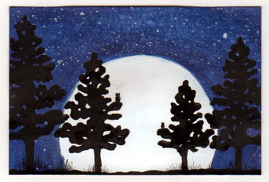
One part of the course I really liked was drawing our own images to print. I loved doing birds. 


 We learned how to make a print with a border. It is more difficult than I thought and quite hard to keep the border clean.  It is a skill that gets easier with practice. 


 We experimented with printing on different types of paper. I liked printing on textured paper a lot. This was a lithograph paper and it took the inks really well. We also printed onto book paper.


Using multiple colours and images to make a complete picture was one of the main skills we learned.


 I seem to be making a lot of pictures with birds in them lately. The birds that live in our street are a major source of inspiration to me.


I don't only use birds though. All of these prints are beginner prints but I can see the potential of this art form. I had so many ideas as the class went on. I will be practicing a lot.

I will recommend this online class to you if these types of monoprints appeals to you. I found the attention given by Linda was more personal and more often than any other class I have done. She was always there to help and made many extra videos addressing problems that came up as we did the course.  Linda did limit the number of people that could sign up for the class at one time so she could respond to everyone as needed. I think that was a great idea.

This was my final online class for a while. I have decided that I need to do more of my own art this year, as well as more of the other projects that I have been putting off for a while. I will still be sharing the creative things I do here, it is something I love to do.  

Wednesday, November 27, 2013

An interesting experiment with ink

I was reading a watercolor book called Watercolor without boundaries by Karlyn Holman. There was an article in there about an artist called Cindy Markowski and she shared one of her techniques using real leaves. She puts leaves onto wet watercolor paper and then drizzles on food colors and places a piece of plexiglass on top. After letting it sit overnight she removes the leaves and uses negative painting of the background to make the leaves stand out.

I decided to try the technique with some inks that I had picked up at my local art store. I probably would dilute the inks a bit if I do it again because the leaves came out quite vivid and it meant I was limited with my background color choice. I had to choose a dark color for the leaves to stand out.


This first image is after I left the leaves on the paper overnight.I had trouble seeing the leaf shapes so I outlined them with a pastel pencil that could easily be rubbed off later. I then started to paint in the background making a few more leaf shapes as I went along.  I have not done anything more to the leaves.


The finished journal page. I have added some veins to the leaves and shaded them with colored pencil. I tried to use the ink for shading but it wouldn't work so that is why I used the pencils. I have added shadows to create depth.  If I did this again I would not do it in a journal because some of the ink went through to the other page.  It is a fun thing to do and I will try it with food color sometime.