Showing posts with label lettering. Show all posts

Saturday, December 23, 2017

The final colour me positive pages for this year.

These are the final two pages for my journal.

 Week 51 was inspired by the old keys my husband gave me. I had to stitch them to the page to make sure they didn't fall off. I made a raised frame for the quote so the whole page had the same level of thickness for my book.

 Week 52 is really the title page for the book. I decided I needed one so this is at the  beginning of the book. I collaged down some printed deli papers to my page.

 I wanted to add lettering that I could doodle inside of so I used a stencil for the letters. Firstly I stenciled the words onto tracing paper so I could see if they would fit and where the best placement would be.
 I used this Deja Vue stencil for the letters. It is a little hard to see here but I used pencil for the outlines. I didn't want to use pen because the surface is a little rough and the pen would have got caught on the textured surface and skipped about.

After I removed the stencil I went over the outline with pen. I was a little easier to control without the stencil in the way. 


Next I used India ink to color in the negative space of the page, blending from one color to the next. You can still see the original background in the letters.  At this stage it is still a little messy.

The finished page. I added lines and doodles around the different colors with a black and a white pen. I felt that this brings the whole page together and it is fun to do. In the next post I will share the video of the journal binding.

Thursday, February 26, 2015

A Different masking technique.

This week the challenge at DLP was to use repeating elements on a page. I did that last week so I must have been ahead of my time, lol. Thinking about last weeks page I wanted to do a less structured type of masking.

 I started my page by slapping on 3 colours of paint: purple, green and pink. I laid on some cling film to make a random texture then picked the film up carefully, turned it 180 degrees and laid it back on the paint again. That meant that the colours mixed on top of each other. I peeled off the cling film and let it dry.

 For the next layer I used some stencils and added some blue paint. It was a little dark so I added some white paint with same stencil in a different position. I use clips to hold my page down when doing this type of wet work in my journal. After it dries I remove them and my page is perfectly flat.

 For the final layer I used my die cut machine to cut out a variety of butterflies from post-its. I put them all over my page and then used a sponge to apply dark blue paint. Because I used a sponge this time there was a lot less bleeding under the post-its. The lines in the blue background come from a paper towel I lightly pressed on while the paint was wet. I stamped on some white butterflies in the gaps when the paint was dry. They didn't stand out enough so I went over them with white pen.

 My writing task this week was to write a word large and add smaller writing on top of it. I used a quote but it doesn't matter what you add because it will be hard to read. It just makes interesting patterns on the letters. 


My watercolor paintings for the month of February are summer themed. I like adding these extra pages into my journal.

This was an extra page I did that was sort of related to last weeks writing exercise. The idea was to add maps, book pages etc and do lettering on top of them. I added a map and then had a large area that was crying out for a painting so I used markers to draw a palm tree. The quote was done with a white pen.

Thursday, January 8, 2015

Documented Life Project

I decided to join the documented life project this year because they are going to do a year of art journaling and it looks like fun. I had already decided to do a year long journal after buying the 'No excuses art journal book' so I am combining the two ideas.

The first prompt for DLP is: be your own goal keeper and the challenge is to use book paper. My main goal this year is to experiment with my art and use familiar materials in unexpected ways.


I started with a blank journal and drew in my own planner, leaving a lot of blank area for art. I did not rule the lines because I wanted it to look handmade. I slapped on two blue colors of acrylics for the background. When it dried I also sprayed it with brown but later on washed off those spots because they were distracting to my eye.


I have 4 books that I use for my mixed media work. 3 of them were falling apart already and the 4th is an old Anne of Green Gables book that I chose because the words were nice. Be careful when you are choosing a book to use. Once I did a class where the teacher bought an old book for a couple of dollars only to find during the class it was full of violence and swear words so nobody wanted to use it, lol.

 I painted one page with blue for the water and while it was still damp I tore it into strips leaving a white edge. I used the brownest book for the sand. The wavy edge comes from tearing across the grain. Any type of paper has a grain and when you tear in one direction you will get reasonably straight lines but if you give the page a quarter turn and tear, the lines will be uneven. The other objects were sketched on the book paper and cut out. The bird wings were done with cut out lines of print.


I glued down the water strips and then the sand. I used a clip to hold the page flat while it dried. With the sand I tried to put some blank areas between each of the printed strips to make them stand out more.  Later on I thought that I should have alternated them with some horizontal strips of print for an interesting look.


I used colored pencil along the edge of the sand to make it stand out. It probably would have been easier if I had done that before they were glued down! I also added a little blue pencil at the base of the waves for shading.


I glued everything down and added a little watery acrylics for color. I kept them watery so they would be transparent. I left the whole thing to dry before I added the shading. 


I did some outlining and shading around each of the parts of the picture. I used a Quick Kutz alphabet to cut the letters out of book paper and added them to my page with some shadows.


I have also bought the 'Whimsical Lettering' book so I am doing a different exercise from that book each week as well. Here I have used a pencil to doodle on the letters that I had cut out. In the book it is supposed to be marker doodles on letters that have been drawn with a marker but this is close enough. I am also adding the weather each day and a brief description and image of what I have done. I hope it will be an interesting journal/diary by the end of the year.

Thursday, April 11, 2013

Where have I been? you might ask.

I am sorry I have been away so long. Just a couple of days after my last post we had some major family emergencies that have kept me from wanting to blog. Both are  resolved and I hope, done with for now, so I am back to the computer again. I have not stopped making art because it helps to keep me sane but I just haven't written about it. I finished off the Life Book lessons and I will share that today.


This last lesson was taught by Bonnie Rose and was meant to be a self portrait but I just did a girl with wings. I love the way the page turned out and can see how much improvement I have made since the start of the year. I am tempted to redo some of my earlier work but I won't. It is good to look back and see what has changed in my art after lessons with so many different teachers. 

When the teachers were announced for this year's Life Book I could see many changes had been made and it looked like another fabulous year of lessons with lots of new teachers. I signed up because it is so cheap for what you get. I will share some of the work I have done in my next post.

Tuesday, March 20, 2012

Lettering on your art journal pages

I have noticed while doing Life Book that several people have been asking about lettering. I thought I would share my tips for lettering that can be adapted to many projects. I have been playing around with fancy lettering since I was in school and used it to decorate my school work. There are lots of ways to achieve the look you want, especially now that computers have so many decorative fonts to help.
The most recent lettering I did was using these mini alphabet stamps. Mine are quite old, about 6 or 7 years and were made by PSX. You may be able to pick some up on Ebay but there are other manufacturers who make similar stamps now. The real tip to using these is successfully is tracing paper. I like to lay a piece of paper on top of my painting and stamp out the words where I think they will fit best. Here is the tracing paper I used for this page.

I used a different font stamp on the draft but when I finished I thought the words were too bold and detracted from all the fine lines in the drawing so I got out my other set of mini alphabet. I stamped two words in brown below the other words so I could see that they were about the same size. You can also see all the other ink colours I tested when the painting was underneath. I also use the tracing paper to work out the spacing of the words. You can see in the draft the length of the lines is not even. When I stamped on the painting I moved the start of each line so it looked more even. I stamped the first line by trying to line up each letter but it was quite uneven when I finished so I ruled pencil lines for the rest of the quote and stamped as close to that as I could. It is still not perfectly even but it looks ok to me. You can use a ruler to line up the stamps if you want it perfectly even but I think it looks more natural when it is a little wonky. Don't try to erase the pencil lines until the stamp ink is dry. I usually wait until the next day to be sure.

I often lay tracing paper on top of a painting to try out lettering or paint colours. It helps me see what works without ruining the picture. I will now show some other lettering styles I have used and give brief explanations. If you want more information don't hesitate to ask. I am happy to share my techniques.


1. This lettering is Basic Grey brand scrapbooking stickers. I think these ones were originally orange. I took all the letters I would need and stuck them to a rubber craft mat. I then painted over them with acrylics (Golden I think). I sprayed them with dye inks and left them to dry. When they were dry I peeled them off the craft sheet and stuck them to the page. If you lay the words out in order on your craft sheet it will help you work out the spacing when you transfer them to your project.


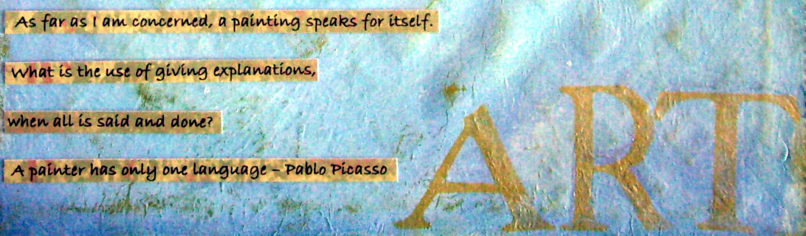
2. This lettering is printed on to scrapbook paper then cut into strips.  The word ART was stamped with paint and large foam stamps, Making Memories brand.


3. More computer lettering printed onto card then cut into strips and glued onto the page. A couple of decorative stitches were added to either end of the strip. If you want to cut the lettering into strips add an extra space between the lines before printing to make it easier to cut into strips.


4.These words were printed onto white card with a little space between them so I could cut them out separately. I coloured them with the same chalks (soft pastels) I had used on the page.


5. This is probably the easiest fancy writing to do. Start by drawing the curvy lines in where you want the writing to go. I then write the quote in capitals, stretching the letters to fill the whole space. I like to keep the upright lines of each letter vertical but the horizontal lines follow the curves. That way the writing looks neat. This is another style you could try on tracing paper on top of the page first if you are nervous about how it will look. You can make as many mistakes as you want on the tracing paper.


6. These letters are stamped and cut out individually. It is a great technique if you don't have too many words to put on a page, or if you need it to fit a certain space.


7. This sample is actually my own handwriting but I have changed some of the letters. I found a computer font I liked and copied the way they did the tails on the Gs and the longer legs on the M, N & H. I also copied their letter A. If your own writing seems too plain to you just change a few of the letters and it looks completely different.


8. This sample was printed on the computer and then I used graphite paper to trace it onto the page. I then went over it with a marker. This is a great technique when you want to fit a lot of words in. If you have a word program you can change the size and style of writing to suit each piece of art. In place of the graphite paper you can rub over the back with a lead pencil then trace the words on that way. Don't use carbon paper because it is oil based and will eventually bleed through your work.


9. This next technique is for those with a little more experience. I have used a computer to print out the words and traced them on. I then went over them with paint, using thick and thin lines. I added decorative dots on random letters  and also randomly added a brown line around some of the letters. It is not a true shadow line but it is similar to that.


10. This last lettering was printed on the computer and then I used a paint brush to copy it onto my work. Printing it out first allows me to copy the size and spacing. This is a little tricky and requires a steady, confident hand.