Wednesday, March 28, 2012

Sewing on paper

Now that the little book is put together I want to add stitching to make it stronger. I poke holes through the book with a sharp awl. I have the book on an old mouse pad and to make sure the holes are even this time I am using a ruler to guide me. I don't always use a ruler, sometimes I want the stitches to look a little uneven. If you poke the holes before you start it makes the stitching a lot easier.


I am using DMC flower thread for this project but you can use any thread you like. I put glue onto the end of the thread and push it into the spine so the end will be hidden. Let it dry then take the thread through the first hole to begin stitching.


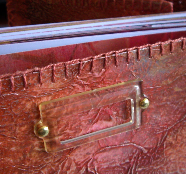
I used blanket stitch around the edge. Just go though the hole making sure the thread is behind the needle. When you pull it up tight the blanket stitch is formed. Continue around outside until you reach the corner.

In the corners I add an extra stitch to hold the thread around the outside neatly. You may have to make your corner hole a little larger with the awl if you can't get three lots of thread through easily.


On this Life Book page I used straight stitch to hold the pages together. It is done the same way, starting with holes poked through the stiff paper with an awl then a straight up and down stitch was used. Every 6 stitches I made a cross stitch by taking the thread around the outside to hold the pages together very strongly.


When you need to add more thread you can't do it like you would on fabric because the knots would show. I usually end my thread by stitching under the previous stitches and adding a little glue to the end to hold it in place. I started the new thread here by gluing it to the edge of the book. When it dries I can continue stitching, covering the end so it is barely visible.

This photo shows the end covered with the new stitches. It is hard to spot where the join is.

Next to the spine on the front cover I added a decorative row of cross stitches. I went up the cover in one direction and then came back down with the stitch going in the opposite direction to make the crosses. It helps to hold the book tape in place, in case the glue ever fails. When I reached the bottom again I continued the stitching around the outside of the cover.
Next is the very important stitching that helps to hold the flap on. At the moment it is only held in place with the soft tissue tape. The diagram above shows how I start with a slight gap between the two pages you want to join. I come up through hole number one and down again at hole 2, then up at 3 and down again at 4. Continue in this manner until you reach the end.

When you get to the end come back along the line in the same way as before starting at 11 and continuing back to the end of the row.
Now come up at 21 and take your thread down at 22, then up at 23 and so on. You are starting to make the crosses now.
When you come back down the row of stitching for the last time you will have made a very strong hinge along the flap. You can take the thread to the edge of the cover and continue the stitching around the outside.  


For this flap I added extra crosses for decoration but they are not necessary.


In this example from the Life Book page I added an extra line of holes to make the diamonds or crosses when the flap was closed.


The little book is now complete. I will use it for a photo album. That is why I wanted a gap between each page when I sewed them in. As I add photos and decorations the pages will become quite thick. 


You can see the back flap tucked inside in this photo.


I am very happy with the way this little book has turned out and will probably make more this way. I think I will try using watercolour paper next time so it can be an art journal.

Tuesday, March 27, 2012

Handmade book


I had a little stack of coordinating paper left over after I made a small scrapbook album. It was white on the back so I thought about putting them together to make a little book. I folded all the papers in half and trimmed them to the same size. Some of the pages were not full size but I used them anyway as they will add interest to the book. I folded some pages with the colour on the inside and some with the colour on the outside to give the book a random sprinkling of the white pages. My pages are 10cm high and 14cm wide when folded.

Next I cut a piece of wide cotton tape a tiny bit larger than the height of the pages.
Mine was 5cm x 10.5cm. I used the gingham ribbon to cover the cut ends. This was going to be the spine that I would attach the pages to.


I used the sewing machine to attach each page to the tape. I stitched the first page a little in from the side so I could tuck the excess tape into the cover. You can see what I mean about leaving some extra in the next photo. I spaced the pages about 3mm apart but it is not even as I was just guessing. I tried to make sure the pages were lined up to each other when they were laying flat as I stitched. You can see on the left in this photo they are fairly even.


When all the pages were stitched onto the tape I gave the back of tape a generous coat of PVA glue to stiffen it. This is important as it makes the spine work better. I only do the back so the pages don't get glue on them. Let it dry completely while you make the cover.


I had some watercolour paper (300g/m2) that I had glued tissue paper to using a watery pva glue. I thought it would make a good cover but as it was not very thick I decided to use two layers. I cut my covers a little larger than the pages, 11cm x 14.5cm. The spine is 11c, x 3.5cm, the thickness of the pages on the tape.


I have book binding tape that I used to attach the spine. You could use ribbon instead but you would have to glue it on.  There is a generous gap between the spine and cover for a soft hinge so the book opens and closes easily. I wanted to add a flap to the back cover so that was cut out of the scraps and stuck on to the cover with tissue tape. The extra pieces are to go inside the front and back covers to make it double thickness.


The fun part is decorating the cover. I used three metallic paints and applied them very randomly. It looks very untidy at this stage but it will get better. It spreads easily because the pva glue I used to apply the tissue paper seals the paper so the paint doesn't soak in as quickly.


While the paints are still wet I sprayed on various colours of metallic sprays. I use mainly Glimmer Mist by Tattered Angels. This makes the background paints blend together more and it collects in the creases and folds of the background. I left it to dry overnight.


The next day I attached a scrapbook embellishment to the front cover then I glued the inside cover to the front cover sandwiching the tape holding the pages between. I stitched the whole lot together for extra strength. I did the same for the back inside cover and flap.


The book is now put together and ready for the hand stitching. I will have more details about that in the next post. This last photo show the inside spine that I left white. I didn't like it so I coloured it with a marker to match the rusty coloured cover.

Thursday, March 22, 2012

Card making

I went to another Kaszazz workshop with my friends this week. It is the first time I have been able to catch up with my pals this year. The cards we made are not standard opening cards so I have included picture of when they are closed and open.


Tuesday, March 20, 2012

Stencils

This is an explanation of how I used the stencils to make this art journal page for Life Book.

 
First I sketched the tree with pencil. Actually I got lazy and did half with pencil then switched to pen and finished it off. Notice how most of the leaves and fruit point down. I think it looks more natural that way. Look outside and you can see in nature that although branches point up the leaves on most trees actually point out or down. I drew the hills in next with only one line.

Then I stamped the sky using a stencil. I covered the stencil (I don't remember where I got this one from) with the stamp ink. It won't completely cover the stencil, but that's ok.


 Next I sprayed the stencil with glimmer mist. It mixes with the ink and forms little puddles all over the stencil.

  I used paper towel to mask off the hills and tree so they stayed white. Then I pick up the stencil and quickly turn it over onto the paper. I put a paper towel on top and press down all over the stencil. The paper towel absorbs the dye that runs out into the swirls so they stay white. Lift up the stencil and admire your art. You can see this time the stencil is well defined at the bottom where I had more spray. At the top of this example it is a little blotchy. When I did the sky for the painting I sprayed the watercolour paper with a light mist of water before pressing the ink on so it would be a softer look. I had to do this several times slightly overlapping the previous blue area to fill the sky.


Next I used watercolours to fill in all the hills in different colours of green.  Again I used paper towel to mask off each area then used stencils to add the patterns with acrylic paint. When I used paper towel for the masking some of the paint went into the area next to the one I wanted. I removed most of it but it still looked a little messy so that is why I drew in the second line and made little borders along each of the hills. It covers up where I didn't stay within the lines, lol. If you want a sharp line when masking, use post it notes to mask off the area and you won't make a mess like I did.


 This photo shows more stenciling that I did with a paint brush and a little acrylic paint. Wipe most of the paint off your brush before you apply it to the stenciled area.

 Next I drew the glass and jug on a separate piece of watercolour paper, coloured them with watercolour pencil and cut them out to stick them to the page.  I forgot to draw them in at the beginning so that is why I had to add them later. I drew the table. The lettering was added with stamps and is explained in the previous post. Finally I used the tumbled glass ink that I had used for the sky to ink the edges of the painting.

Lettering on your art journal pages

I have noticed while doing Life Book that several people have been asking about lettering. I thought I would share my tips for lettering that can be adapted to many projects. I have been playing around with fancy lettering since I was in school and used it to decorate my school work. There are lots of ways to achieve the look you want, especially now that computers have so many decorative fonts to help.
The most recent lettering I did was using these mini alphabet stamps. Mine are quite old, about 6 or 7 years and were made by PSX. You may be able to pick some up on Ebay but there are other manufacturers who make similar stamps now. The real tip to using these is successfully is tracing paper. I like to lay a piece of paper on top of my painting and stamp out the words where I think they will fit best. Here is the tracing paper I used for this page.

I used a different font stamp on the draft but when I finished I thought the words were too bold and detracted from all the fine lines in the drawing so I got out my other set of mini alphabet. I stamped two words in brown below the other words so I could see that they were about the same size. You can also see all the other ink colours I tested when the painting was underneath. I also use the tracing paper to work out the spacing of the words. You can see in the draft the length of the lines is not even. When I stamped on the painting I moved the start of each line so it looked more even. I stamped the first line by trying to line up each letter but it was quite uneven when I finished so I ruled pencil lines for the rest of the quote and stamped as close to that as I could. It is still not perfectly even but it looks ok to me. You can use a ruler to line up the stamps if you want it perfectly even but I think it looks more natural when it is a little wonky. Don't try to erase the pencil lines until the stamp ink is dry. I usually wait until the next day to be sure.

I often lay tracing paper on top of a painting to try out lettering or paint colours. It helps me see what works without ruining the picture. I will now show some other lettering styles I have used and give brief explanations. If you want more information don't hesitate to ask. I am happy to share my techniques.


1. This lettering is Basic Grey brand scrapbooking stickers. I think these ones were originally orange. I took all the letters I would need and stuck them to a rubber craft mat. I then painted over them with acrylics (Golden I think). I sprayed them with dye inks and left them to dry. When they were dry I peeled them off the craft sheet and stuck them to the page. If you lay the words out in order on your craft sheet it will help you work out the spacing when you transfer them to your project.


2. This lettering is printed on to scrapbook paper then cut into strips.  The word ART was stamped with paint and large foam stamps, Making Memories brand.


3. More computer lettering printed onto card then cut into strips and glued onto the page. A couple of decorative stitches were added to either end of the strip. If you want to cut the lettering into strips add an extra space between the lines before printing to make it easier to cut into strips.


4.These words were printed onto white card with a little space between them so I could cut them out separately. I coloured them with the same chalks (soft pastels) I had used on the page.


5. This is probably the easiest fancy writing to do. Start by drawing the curvy lines in where you want the writing to go. I then write the quote in capitals, stretching the letters to fill the whole space. I like to keep the upright lines of each letter vertical but the horizontal lines follow the curves. That way the writing looks neat. This is another style you could try on tracing paper on top of the page first if you are nervous about how it will look. You can make as many mistakes as you want on the tracing paper.


6. These letters are stamped and cut out individually. It is a great technique if you don't have too many words to put on a page, or if you need it to fit a certain space.


7. This sample is actually my own handwriting but I have changed some of the letters. I found a computer font I liked and copied the way they did the tails on the Gs and the longer legs on the M, N & H. I also copied their letter A. If your own writing seems too plain to you just change a few of the letters and it looks completely different.


8. This sample was printed on the computer and then I used graphite paper to trace it onto the page. I then went over it with a marker. This is a great technique when you want to fit a lot of words in. If you have a word program you can change the size and style of writing to suit each piece of art. In place of the graphite paper you can rub over the back with a lead pencil then trace the words on that way. Don't use carbon paper because it is oil based and will eventually bleed through your work.


9. This next technique is for those with a little more experience. I have used a computer to print out the words and traced them on. I then went over them with paint, using thick and thin lines. I added decorative dots on random letters  and also randomly added a brown line around some of the letters. It is not a true shadow line but it is similar to that.


10. This last lettering was printed on the computer and then I used a paint brush to copy it onto my work. Printing it out first allows me to copy the size and spacing. This is a little tricky and requires a steady, confident hand.