Wednesday, December 26, 2018

Colour me Positive 2018

I had good intentions to do another year with the Colour Me Positive challenge in 2018. I started out well but as I had to support my daughter with an extremely serious health battle for the first half of the year my interest in keeping up with the art journaling faded away. I will share the pages I did complete here.

  
Week 1: I stencilled gesso onto my page and when it was dry painted it purple and added copper highlights with metallic paste. It is a simple and fast page. 


 Week 2: I used coloured pencils to draw the eye on a background that had been painted then some wiped off before drying. My journal was made from old scrapbook paper that had a thin layer of gesso spread on it with a credit card.  You can still see some of the printed paper through the blue paint.


Week 3: I used a die cut machine to punch butterflies out of left over scraps of painted papers. After they were glued to the page I outlined them to be more visible. 


Week 4: I wanted this page to be focused on the words so I kept it simple. I used a stencil for the lettering on a previously painted paper that was glued in. I then doodled around the painted areas on the page. I did add some more paint in some areas to make them darker. 

Week 5: I had this picture of a vintage lady that I wanted to use so the rest of the page is done using vintage style papers. A little brown ink around the edge of shapes makes everything look old and work together.  


Week 6: This page was an experiment. I traced the sunflowers from another journal page I had drawn onto tissue paper. I then crumpled the tissue and glued it to this double page. While it was wet I sprayed on the blue and green background. When it was dry I used watercolours to paint the flowers and added the insects. 

Week 8: I don't know why I didn't do week 7. This background was randomly made using a credit card to spread three colours around the page. When it was dry I could see a fox face so I added more paint to enhance the face I could see. It is all done in acrylics. 


 Week 9: I got some new watercolours and decided to test them out on this page. Sometimes simple and quick means you get more done.

 Week 10: I wanted to try a masking technique when stencilling. You can see where I placed a circle of paper before using gesso to stencil a pattern over the whole page. When you remove the stencil the circle lifts away too and there is a smooth area to write in. The page was quickly coloured using dye sprays.


Week 11: I wanted to doodle one evening so this page was made. I used a lot of scrap papers and a few collage pictures to make the squares then doodled and wrote on all of them. I love working with grids because it is easy to make a lot of small things and then put them together to make a large piece.


Week 12: This was the last page I did for the year and the last page in this journal. I used perforated paper for the background. It is meant to be used for cross stitch and was in my stash. I wrote out the quote then added a simple border. It was coloured with standard markers.


 The cover of my hand made journal has a picture that I saved from a Flavia calendar. I love her style of art.


The back cover is a collage of some torn. previously painted, paper strips. When it was dry I added the doodles.


The inside front cover was zentangled. Sometimes I just want to sit and draw or doodle. I find it relaxing.


This zentangled page is the inside back cover of the book. That was the end of this challenge for me. I still journal a lot but now I try ideas from the many art books I own. I have decided to stop looking at them and actually do the exercises from the books. It is a fun way to learn new things.

Thursday, December 20, 2018

Adding texture to textiles

I have a new video about adding texture to your textile work. If you want to see it larger on YouTube click on this link: artygirl2010 video.


The technique is quite simple using any art mediums you have. You can add colour or other items to the gels and pastes then spread them on your fabrics using a palette knife or brush. I used both natural and synthetic fibers and they both worked, some colour reacted differently on the fabrics and mediums. I did a lot of experimenting with the different mediums I own. I did a sample of each of the things I tried, noting down what they were. I then hand stitched, machine stitched and machine stitched with metallic thread on each of the samples so I could get an idea of how hard they were to stitch into. I also did a blue stripe of fabric paint and another stripe of turquoise acrylic paint to see how it handled the colour.

As mentioned in the video I am putting photos here of all the samples I shared. Click on each photo if you want to see a close up photo.


Teabag paper
Tyvek melted with a heat gun

Dress pattern and sand texture
Dress pattern reverse
Lutrador with stencilled texture paste melted with heat gun.

Some of the other samples I shared in the video are these ones where I added Dylusions Turquoise spray to the mediums before I spread them on the fabric.

 This first photo is the leftover bits of medium I spread onto scrap fabric and sprayed during the video. You can see the variety of colours that showed up. I also rubbed a very small amount of copper wax in a few areas to highlight the texture.


 This is another sample from the video where the colour was mixed into the mediums first. I have since sprayed turquoise mica spray on some squares. I also painted copper acrylic paint on the back of the corner squares so it would not colour the texture on the front of those sections. The lower middle textures have metallic wax rubbed onto the texture.


This is the fiber paste sample I made during the video with copper acrylic painted on the reverse side when it had dried. I did all of these small pieces so I could cut them up for a larger project.


In this trial layout I have used all of the above samples including the larger leftovers piece. I used a lettering stencil to trace and cut out the letters from the leftover piece. As I started to embellish and stitch each square for my piece I did change the layout many times until I was happy with how it looked.


The finished piece has a lot of hand stitching, beads, stones and jewelry findings. It was for my textile group's colour challenge.

Thursday, December 13, 2018

A big twist on a WOWbook lesson

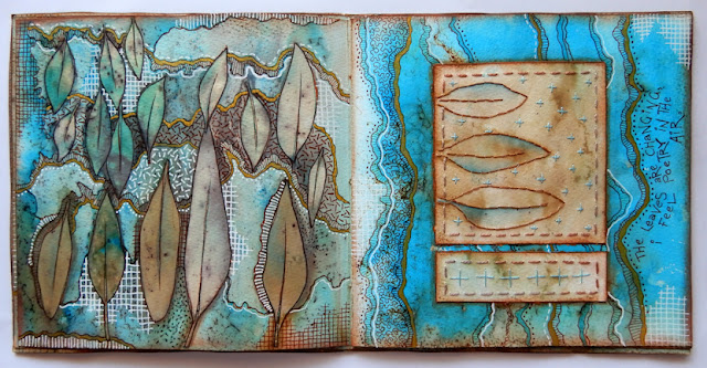
I have mentioned once or twice already that I have been doing the workshops in the WOWbook series. This eco-dyeing onto paper was one of those workshops I wanted to try. For full details you will need to get the book from the d4daisy website. 

I changed the technique a little by using procion dyes spread over the paper before I sandwiched it with leaves and more paper. I expected the dye to disperse in the pot but it didn't do that at all. The colour is a lot stronger than I had anticipated but I still like the way it turned out. The paler pages were not dyed but did pick up dye from the water.


I liked the way the prints turned out so I made then into a book. I kept a couple of pages out to use for collage in the book. I also wanted to stitch on the extra pages so the back of the stitching would be hidden when I glued them into the book.  I used coloured pencils to outline the leaf prints and added shading around some of the images.


 After a couple of weeks I decided to add doodles to make the book more interesting for the viewer. I used a white pen and fineliners for the extra drawing.

 
 I also used steel wool fibers on the leaves for rusting. These became the dark dots you can see everywhere. One day, when I was pulling apart steel wool for rusting I didn't realise that little fibers were falling off the metal onto the fabric below. After I left my bundle of fabric to rust I unwrapped it all and was surprised to see little marks and dots everywhere. I liked the effect so it is something I do quite often now, when I am rusting cloth.


 Here you can see the difference in the before and after the extra drawing. I kept the colour palette consistent throughout the journal but did whatever drawing I fancied on each page.


 I wasn't sure what I was going to do with the left page here so it was one of the last ones I finished. I also used gold pen throughout the book for highlights.


 I added a few quotes about leaves to the book and also wrote the names of some of the plants I used for the prints. You can see one name in the bottom left area.


 Sometimes I used the doodles to hide areas of eco-printing that weren't as nice as I would have liked.


 I mainly used stranded embroidery thread for stitching but on a couple of pages I used a metallic gold thread, as in the crosses above.


 It was interesting to see how some plants reacted so differently to the dyeing process.


 All of the leaves on the right hand page came from the same eucalyptus plant. Some were green and some had turned red. I was surprised that the red ones dyed the paper browner than the green ones.


 There were a lot of steel wool fibres on the page on the right. I used the image to hide some of the darker areas.


 The page on the left here is one of the paler ones that didn't have dye applied to it but did still have the print of the leaves on it. I did use coloured pencils to make the blue areas darker. I always do what I think a piece needs and am never afraid to try something different. If it doesn't work the way I want,  I change it or use it in another project.

This little journal was a great piece that I could work on whenever I finished something and was looking for a small project to keep my hands busy while I planned the next thing. One of the reasons I love WOWbook so much is that it covers all sorts of mixed media and textiles. It pushes me to think of how I can adapt a technique when I don't have all the required materials to hand. The only reason I used dye here was because I didn't want to wait 3 weeks to make iron water as instructed and it was the first thing I saw when I looked in my cupboard for something else to use. I do like this technique and have since repeated it with a more diluted dye.

Wednesday, December 12, 2018

What a year it has been.

I have not shared much on my blog this year although I have made and experimented with a lot of techniques. I am definitely going to change that next year and hope to also add more video. I have a new camera now so it should be easier for me to film and edit videos.

These first textiles I will share are my entries for my textile group's challenge this year. We had to choose one colour to feature and could use one other colour for contrast. The subject and technique were up to us. 


My first entry was based on texture techniques. Half of these squares were made from bits I had left over from a previous work. I did make some more to use and added a lot of bead embellishments. I have done a video of the technique that I promised to share. It will be uploaded very soon. 


This giraffe was made from a photo I took at a zoo. The giraffe was happily munching away on lunch and watching me take photos of him. It gave him a bemused look. I used a technique from the June 2016 edition of workshop on the web by Kathryn Harmer Fox. It was very difficult to get the shading right using only purple (as stated in the challenge rules) but I think it turned out ok. 


My third entry was based on the Vanishing Worlds workshop by Angie Hughes in WOWbook 1. It has a printed felt background and melted textiles for the tree. This one was a lot of fun to make. I love all the different techniques I am learning from the WOWbooks. I think they are worth every cent and love the members club where so many extra techniques and ways of doing things are shared. 

I will continue to share a few more completed works and some techniques in more detail in future posts that will be coming up soon. Til then, happy stitching.