Thursday, June 30, 2011

Printers Tray


I found a cardboard printers tray at my local scrapbook store (Scraptivate.com.au) that I couldn't resist. I thought it would make a great display piece for my studio.


 I glued the whole thing together then covered it with torn, scrunched pieces of tissue paper. I wanted it to have a slightly roughened texture.


 Next I used green acrylic paint to color the whole thing. I then went through my stash of craft stuff and selected all of the little embellishments that I wanted to use. I didn't worry what color they were because I would alter them later. When I saw the pile of things I was going to use, especially the flowers I realized the tray was the wrong color. I went over it with Folk Art metallic paint in the color champagne. It gave the tray a more neutral appearance so the embellishments would stand out more.


Some of the things I chose for the tray were colored with alcohol inks. The gold square was painted with lumiere metallic paint. The butterflies were done with brown and green alcohol ink but later on they seemed a little dark compared to the rest of the tray so I lightened them with a pink brilliance inkpad that still allowed some of the alcohol ink to show through. The bird is one of my larger paintings that I have photographed and printed out. I then glued it to a domino and covered the painting with dimensional magic gloss paint. I painted the frog with acrylic paints. The dragon fly corner is an old provo craft wood product from my stash that I have painted with acrylics. You could use an easel to display the tray or hang it on the wall like I have done.

Sunday, June 19, 2011

New journal pages

 I did a credit card background for my next journal pages.I chose two scrapbook papers to start because they were a little thicker than regular paper. It is a good way to use paper you no longer like.


They were different, one a bit red and the other yellow. The yellow one was flocked as well. I used an old gift card that had no value left to spread the first layer of green acrylic paint across the page. I allowed some of the original paper to show through but you could cover it completely if you want.


While that was still half wet I put copper acrylic paint across the top of the pages and used the gift card to drag the paint across the paper. You can still see some of the green paint and a little yellow near the top.


This closeup shows the flocking. It is no longer soft but adds an interesting texture to the page. You don't have to use metallic paint for this technique but I think it looks good. You can apply two coats of paint on top of the base color if you want a different look. I suggest making a few samples so you can try colors and effects. Having the metallic as the base coat looks good too.


When that was dry I used stamps and white ink to stamp a background of flowers. The white ink didn't show up very well so I went over it with a white pen. I liked the way the original stamping looks like a shadow underneath the ink. The phrase was white embossed and the butterflies are cut out of Prima brand paper called "miss pretty".
This page has a painting on it that I did when I first started using watercolors. It used to be framed but I have now switched that for a new piece so the old art is now here. I wrote the quotes on with the white gel pen. I like the 'uniball signo' gel pens, the ink flows smoothly and has not clogged at all so far (mine are at least 6 months old). Enjoy.

Monday, June 13, 2011

Beach Album


I have been a scrapbooker for a while now. I have always liked these photos of a sunny day at the beach with my children so I decided to put them in their own mini album. I used the BoBunny chipboard album shown here. I decided to keep it fairly simple in style because I wanted the photos to stand out so they take up most of the page. I stitched around the edge of the pages because I wasn't sure the glue was strong enough and I didn't want it to fall apart in the future.
The completed album.


Saturday, June 11, 2011

A new art journal book


You can see how raised it is here. 

I made the cover for my new journal from two pieces of matboard. I had this textured paper that I had bought a while ago so I decided to use it for the cover. It is self adhesive so I just cut it to size and stuck it on the cardboard. I joined two pieces for the back cover.


I used Lumiere metallic paints to add color. I gave it two coats, as well as two cardboard frames I was going to use. The 7 gypsies brown paper tape was used to go around the edge because it was a little rough. I then stitched it to make sure it stayed in place as the tape wasn't very sticky.


The finished cover. I felt there wasn't enough color after painting so I sprayed the surface with glimmer mist. It ran into the crevices and added more detail.  I then used some of my large paintings that have been scanned and reduced in size in the frames.When I was punching the holes in the side of the cover to tie the book together I made a mistake and put the holes along the top edge. I thought the book was too big to flip at the top of the page (8 ins) so I had to put more holes in the left hand side. Then it looked funny with the holes at the top of the page so I added more holes around all of the sides and threaded the green string through.

It would look better without it but sometimes you just have to adapt your mistakes or else start over again and that just seems like a waste of time to me. This is the finished back cover.

Thursday, June 9, 2011

A new art journal

I have decided to make a new art journal to put the small experimental sketches and art works that I make before I make a larger piece. It should be a useful resource of things that worked and the ones that didn't.


Step 1: I started with this piece of scrapbook paper that I thought would be a little too busy for photos.


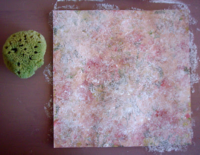
Step 2: I used a natural sponge to dab gesso all over the page allowing some of the original color to show through. When it was dry I used some Moon Shadow Inks to color the page.


Step 3: I thought there was too much detail still showing through so I gave it another coat of gesso with the sea sponge. When dry I again applied the inks.


Step 4: I was happier with the look now.I flicked on some of the inks in big blotches. I dried some of these with a heat gun so they would have a brown edge. If you let it dry naturally the glittery color is more even.

 Step 5: the final page has a couple of bird silhouettes that are scrapbooking rub ons. The quote is white gel pen and chipboard letters that have been colored with metallic stamp inks. I used Colorbox Micamagic.The word ART was embossed in a cuttlebug machine.  I then used a silver metallic thread to do some free motion stitching on the page. It is a little hard to see. There are small green diamantes glued on next to the stitching.